Table of Contents
How To Access On Goldcast Studio Platform
- Platform Panel → Events → (open desired event) → Look & Feel
- Platform Panel → Events → (open desired webinar) → (click paintbrush icon) → Event Stage
Introduction
Branding gives your event its unique look and feel, which can be aligned with your company or event style. Goldcast offers numerous customization options, including colors, images, fonts, and more.


Update your event's look & feel
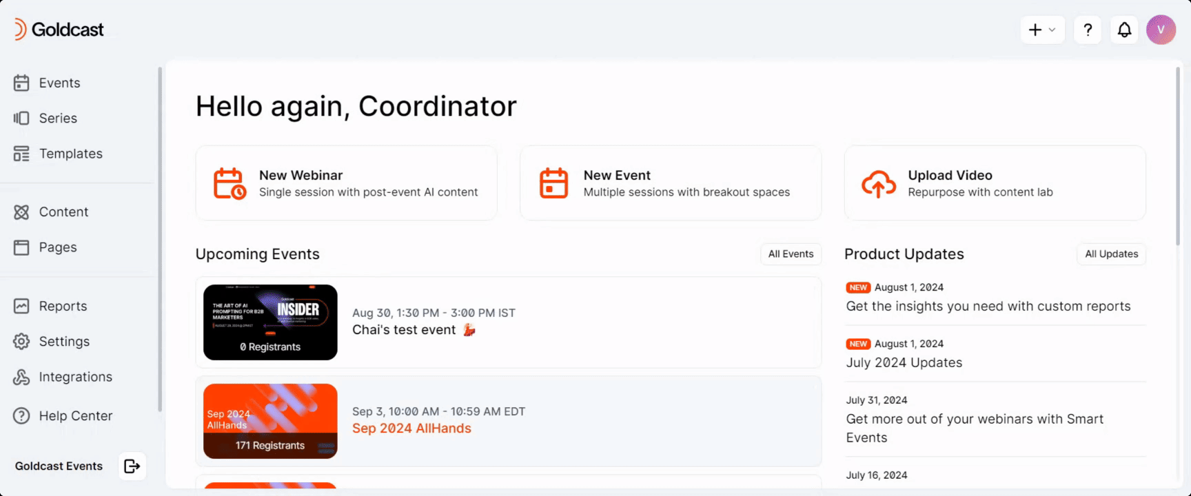
- Log in to Goldcast Studio with your credentials, and select the Events tab.
- From the Events list, click the event you want to edit.
- Click the Look & Feel tab on the left of the screen.
On the right side of this page is a list of all the customization options. On the left side is the preview window, where you can see how your branding choices will look in your event. These screens are representative of the themes across multiple Goldcast pages, including your event landing page, event stage, and other tabs inside your event, including agenda, rooms, and booths.
Preview and save
After you have made any changes to the Look & Feel section, check your changes in the preview window and confirm the appearance of both the Desktop and Mobile views. You can do so by selecting the Preview buttons at the top right of the page.
Click the Save button when you are satisfied with your changes. If you do not click Save, your changes will not be displayed on your event.

Look & Feel and Engagement Options
There are four under the look & feel tab: Global Settings, Event Landing, Stage, and Engagement & Communication.
1. Global Settings
Click the arrow to the left of the Global Settings row to get started.

Button & Card Color
Select your button background and button font color. This color will be used for all buttons throughout your event space, including your navigation bar selected items. This color will also be used for the background color of any placeholder slides, Q&A questions, and polls that you publish to the stage, as well as popups and modals. (Buttons inside popups and modals will use the reverse button & font colors.)
You can choose a different color for screensavers, Q&A, and polls by turning off the setting Screensaver color same as button color and selecting background and font colors. Be sure your font color is clear on the background color.
Logo
Upload your logo here. Use a PNG, JPG, or JPEG file with a 1:1 aspect ratio. Once you upload a file, your logo will appear in the top left corner of the navigation bar in the preview window. This logo will also appear on the card shown on stage before the event begins.

Favicon
If you upload a favicon, it will appear at the top of the browser tab where your event is open. Use a 32 x 32px image in a PNG file format.

Social Media Thumbnail
Upload an image you want to display as the thumbnail when you share your registration page URL. This image is also used for the registration page tiles for events, webinars, series, and hub pages.
Note: The recommended dimensions are 1200px × 630px. For more details, refer to this page.
- For events: Go to Look & Feel → Global Settings → Social Media Thumbnail
- For webinar: Navigate to Webinar Design dropdown → Event Stage → Global Settings → Social Media Thumbnail to upload your image.

Once uploaded, this image will appear automatically when you share your registration page URL on external sites (for example, LinkedIn), and as the tile image on the registration page.
When a Social Media Thumbnail is uploaded for an event or webinar, that image will also display as the registration page tile in the series or hub pages, or any place where the event or webinar is added.
➡️ To make the thumbnail visible on a series registration page, you must upload the thumbnail individually for each event in that series.
➡️ The same applies to webinars added to a series or hub page.
Heads up! This may take up to an hour to change, depending on the site you are posting the URL to. You can confirm the thumbnail upload worked successfully by pasting your registration URL here: LinkedIn Post Inspector
2. Event Landing
The event landing page is the page your attendees will land on before entering your Goldcast event. They will be able to see the agenda and click the Enter Event button to join your event.

Header Settings
The header or hero background will appear at the top of your event landing page. You must select a Desktop option and a Mobile option. We recommend keeping these selections the same.
Your hero background can be an image, a solid color, or a gradient.
Image
Make sure the images you upload meet the following requirements. This will ensure that it looks great on all screens and device sizes.
|
Desktop
|
Mobile
|
If you are using an image and have embedded your event details in it, you may choose to hide the event title and date from the page. To do this, deselect the Show Title option. If you leave the event title visible, you may choose a unique text color for the title.

Learn more about designing a landing page background.
Solid Color
To select a solid color, use the color picker to choose a color for Desktop and Mobile.
Gradient
To select a gradient, use the color picker to select colors for Desktop and Mobile gradients and a gradient type: radial or linear.
Event Landing Font
Choose a font for your event landing page. You can select from the Goldcast Font Library, a Web Font, or a Custom Font. We recommend using a web-compatible font with Regular, Medium and Bold weights.
- Confirm that the font color is readable on your event landing page (by using the preview window or opening the event landing page in a new window).
- To choose a font from the Library, select a font from the Font Type dropdown.
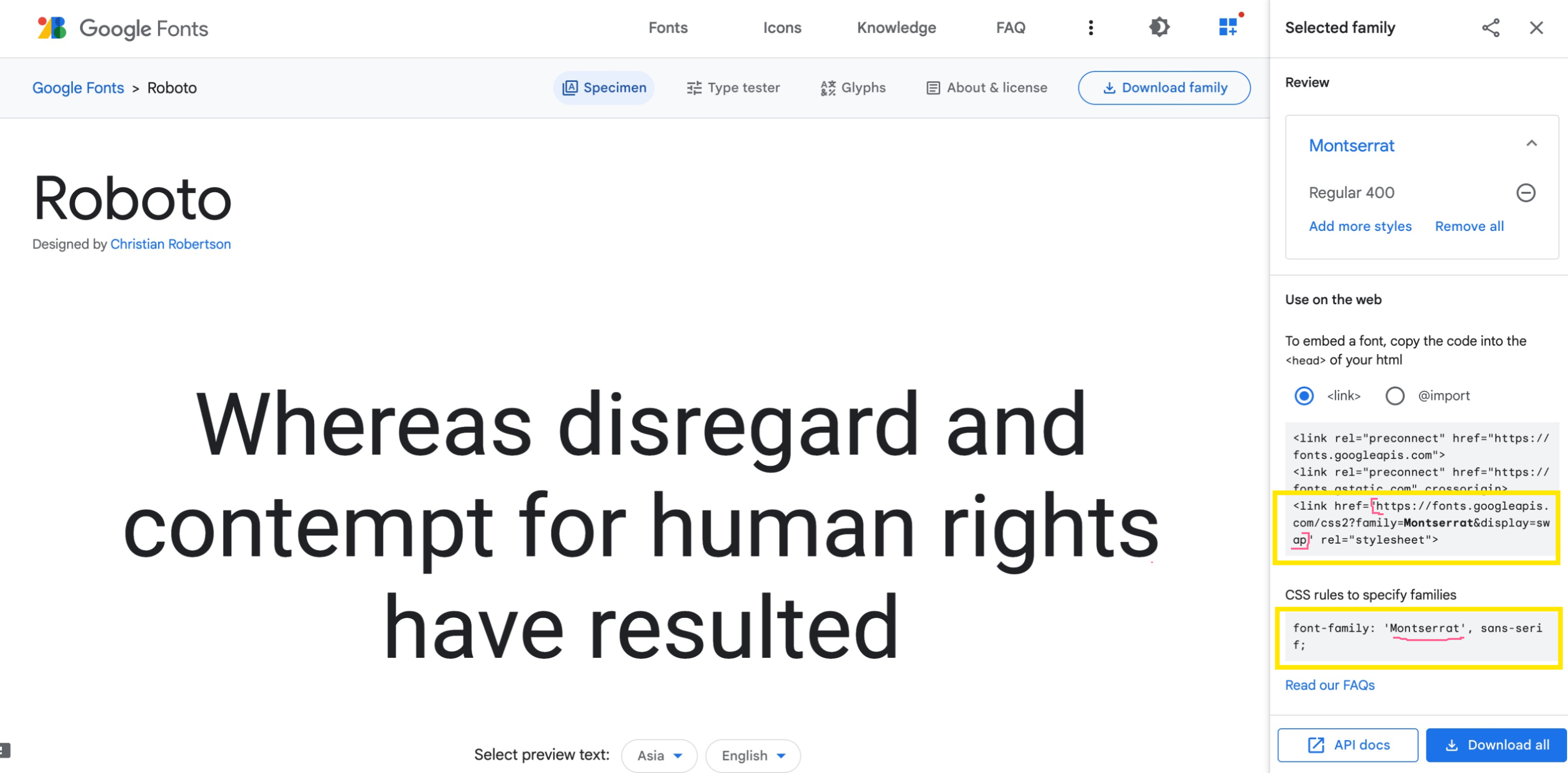
- To use a Web Font, select “Web Font” from the Font Type dropdown and enter the font name and URL.
- To upload a custom font, select “Custom” from the Font Type dropdown and upload a TFF file.
Pro Tip: Make sure you are populating the Font Name and Font URL correctly. The screenshot below highlights the values to be copied for both.
Enter Event Experience
When attendees enter your event for the first time, there are three optional experiences you can enable:

- Mandatory Attendee Profiles – Require attendees to create a profile when entering the event for the first time.
- Attendee Tech Check – Require attendees to test their network strength and audio before entering the event. If you turn this setting off, attendees can directly enter the event without testing their network and audio.
- Allow Users to Enter Event Early – This setting cannot be changed less than one hour before the start of the event. Turn this setting off to prevent users from entering your event space. 60 minutes before the event starts, users will all be able to enter the event space.
Tracking Pixel Snippet
The Tracking Pixel Snippet section in Event Landing allows you to add custom JavaScript tracking codes or pixels to your event’s splash page. This is useful for tracking visitor behavior, marketing conversions, or triggering analytics tools like Google Tag Manager, HubSpot tracking, or Facebook Pixel.
When you add a tracking script here, it executes when the Event Landing Page (Splash Page) loads. You can use this space to integrate third-party analytics or automation platforms that require a small tracking code snippet.
3. Stage
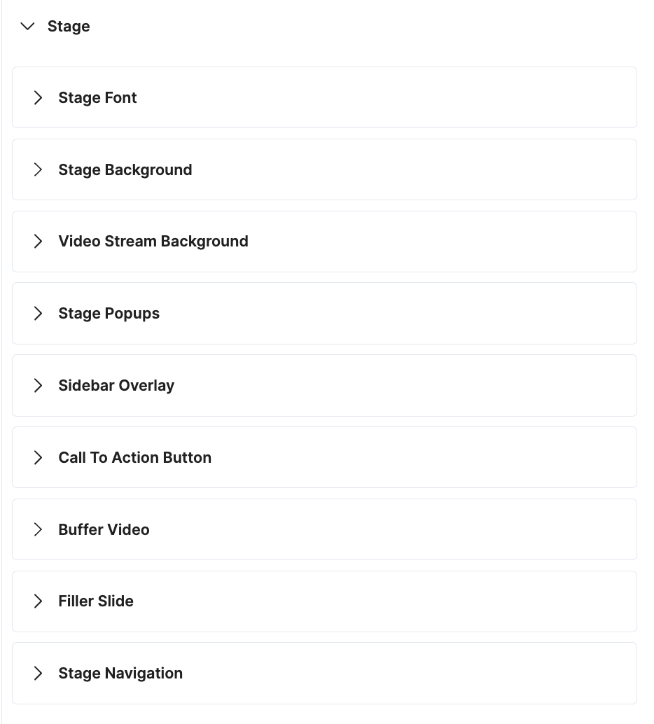
Stage Font
Set font types and font color as desired—the font setting for the stage section is similar to that of the event landing.
Once you've done this, check the preview and verify that the font changes match properly with the stage background or images in both mobile and desktop views.
Pro Tip: The font color you choose for the stage will also be applied to the booth and room description, chat messages, and other navigation buttons in the event. So, make sure to select a font color that is visible over your selected stage background images or colors, the stage popup color, and is easy to read.
Stage Background
The stage background will be the background image or color inside your entire event page. We recommend picking an image or color that is fun and engaging, but that your content is still easily visible and readable on top of. Your stage background can be an image, a solid color, or a gradient.
Image
Please make sure the image you upload meets the following requirements. This will ensure that it looks great on all screens and device sizes.
|
Desktop
|
Mobile
|
Solid Color
To select a solid color, use the color picker to choose a color for Desktop and Mobile.
Gradient
To select a gradient, use the color picker to select colors for Desktop and Mobile gradients and a gradient type: radial or linear.
Video Stream Background
The video stream background is the image or color that appears inside the stage area behind your live speakers or shared content like slides. We recommend picking an image or color that will not distract from your live speakers during your sessions. Your video stream background can be an image, a solid color, or a gradient - see details on these options above in Stage Background.
Stage Popups
This setting will control the background color for pop-up modals in the event and for your pinned chats or personal chats.
Sidebar Overlay
The sidebar overlay will control the look of your sidebar and navigation bars. Choose a Dark or Light treatment. Move the sliders to adjust the Opacity and Blur.
Pro Tip: Make sure your text is readable on the sidebar and navigation bar, depending on the Stage Background, Font color, and Button & Card colors you have selected.
Call To Action Button
This is a button you can enable on your event to invite attendees to click and submit their information. You can use this button to offer demos, swag, prizes, or set up meetings—whatever you’d like!
Select the toggle to enable the button. Then, fill in the Button Text, Submit Type, Confirmation Title, and Confirmation Message. The button will appear in the top navigation bar of your event. Once clicked, an attendee will see the confirmation title and message. At the end of the event, in the Dashboard, you can see who clicked this button and follow up with them accordingly.
Buffer Video
The buffer video plays on stage before the event and between sessions. It’s a great way to welcome people to your event and keep the energy high. To add a video, click the Select Video button and either upload a new video or pick one from your video list. For more information, see our help guide on buffer videos.
Filler Slide
The filler slide is shown:
- Before a prerecorded video starts to play
- When a prerecorded video ends before the session end time
- Before the broadcast is switched back to live
Filler slides must be 1920x1080px .jpg, .png, or .tiff files. If a slide is not uploaded, the Goldcast logo will display by default.
Note: Filler slides cannot be updated less than 60 minutes before the start of your event. For more information, see our help guide on filler slides.
Stage Navigation
Select and rename which tabs appear in your event space. To hide a tab, turn off that tab’s setting. To rename a tab, enter a new name in the “Title” field. List of tabs which can be controlled from Stage Navigation:
- Rooms Tab
- Booth Tab (Both Primary & Secondary)
- Speakers Tab
- Attendees Tab (For Attendees & Speakers)
Effective December 1, 2025
- For new events and templates, the Attendees (People) tab is turned off by default. Attendees will not see a list of other participants unless you enable it.
Existing events and templates created before December 1 are not affected and will keep their current Attendees (People) tab settings. -
Attendee Profiles are off by default in all new events and templates. Attendees will not be able to view each other’s profiles unless you enable this setting.
Existing events and templates created before December 1 will continue using their existing Attendee Profiles settings.
4. Engagement & Communication
Control additional elements on your stage and communication options for your attendees.
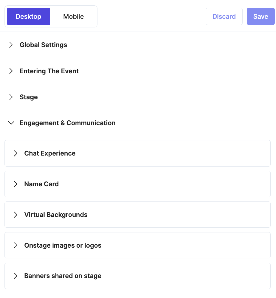
Chat Experience
Choose how your attendees will engage with chat, Q&A, and more during your event.
Public Chat
All attendees, speakers, and organizers can post messages for everyone to see live during an event. If this setting is disabled, only speakers and organizers can post messages for attendees to view during the event.
Session Chat
Enable users to engage with a chat thread specific to each session. If this setting is disabled, the “Session Chat” tab will be hidden, and only the “Public Chat” will be visible.
Direct Message
Attendees can privately message other attendees, speakers, and organizers. If this setting is disabled, no one can send or receive private messages in this event.
Effective December 1, 2025
In newly created events and templates, Direct Message is disabled by default, preventing attendees, speakers, and staff from sending private 1:1 messages unless you turn the feature on.
Events and templates created prior to December 1 will continue using their existing Direct Message settings.
Moderate Text Q&A
Require moderators to approve or reject questions before they are shown to the audience in the Q&A tab. If this setting is disabled, all questions will be immediately posted.
Assign Questions from Q&A
Allow attendee questions in Q&A to be assigned to a specific speaker or staff.
Anonymous Text Q&A
Attendees can ask questions anonymously. If this setting is disabled, all questions will include the attendee’s name.
Show Answerers' Identity
Show the name of the person who answered the question. If this setting is disabled, typed answers to questions will not have the organizer’s name listed.
Answerers' Alias
If you prefer to post an alias as the person who answered questions, enter it here. For example, answers can come from the “Company XYZ Team” or “Event ABC Team.”
GIFs
Attendees can send GIFs in chat. If this setting is disabled, no GIFs will be visible in the chat.
Heads Up! Goldcast uses Giphy, the online GIF database, to allow attendees to search for and share animated GIFs in chat. We only allow G-Level 1 GIFs with no profanity, sexual content, violence, weapons, or substances/drugs.
Room Chat
Attendees can chat with other attendees in the Rooms. If this setting is disabled, the “Room Chat” tab will be hidden, and only the “Public Chat” will be visible.
Booth Chat
Attendees can chat with other attendees in the Booths. If this setting is disabled, the “Booth Chat” tab will be hidden, and only the “Public Chat” will be visible.
Name Card
Name cards display your speaker’s name and information in colors that match your event branding. To enable branded name cards, select the Name Cards toggle.
- Select either the round or rectangular shape by clicking the radio buttons.
- Select the Speaker Title toggle to include your speakers’ titles and company names under their names.
- You can reverse the colors making up the Name Cards using the Reverse Colors toggle.
Virtual Backgrounds
Speakers in Goldcast events can choose to have no virtual background, use a standard blur, or select from an image or images the event organizer uploads.
To upload background images for your speakers to use:
- Click Upload Image, then select a file from your computer.
- Note that your image must be smaller than 1600 x 1600px and should have a ratio of 16:9 for best performance
- Click Upload.
- Now that you have uploaded an image, you will see it populate in the Preview window on the right, behind the images of the sample speakers
- You can choose to upload more images. If you upload more than one image, you will need to identify one image as the Default Image. This background will show up behind your speakers automatically when they enter your event until they change it or remove it.
- To select your default image, click Make Default next to the image thumbnail
Selecting virtual backgrounds
During the event, the image you selected as the Default image will automatically populate as the speakers' background image.
To change this image:
- Click the settings gear in the toolbar.
- Under the virtual backgrounds section, choose from None, Blur, or one of the uploaded image options.
- If no virtual background images are uploaded, speakers will always have the option to have no background (None) or a blurred background (Blur).
- If you upload a virtual background while an event is live, speakers must refresh the Goldcast event before they can see it.
For more information, see How To Add a Virtual Background.
Onstage image or logos
You may upload logos from sponsors or your own company, or images you’d like to share on the stage during your event. You can publish these images to the stage during your live event and select a location for them to appear (one of the four corners of the stage, the top middle, the bottom middle, or full screen).

The images you upload should be in a 1:1 ratio. You may upload more than one image. Select the Upload Image button to upload each image separately.
Banners shared on stage
Moderators can choose chat comments to present as banners on stage during the event. In this section, you can select the banner's style. You can also use your Button or Popup Color for the banner. You can also reverse your banner colors by disabling the Reverse Colors toggle.
List of Specs and Assets
| Item | File type | Size |
| Logo | PNG, JPEG, or JPG | 1:1 aspect ratio |
| Favicon | PNG | 32x32px |
| Font | TFF | n/a |
| Stage Background Image – Desktop | JPEG or PNG |
4:3 aspect ratio 1024x768px min 2400x1800px max |
| Stage Background Image – Mobile | JPEG or PNG |
3:4 aspect ratio 600x800px min 1200x1600px max |
| Video Stream Background Image – Desktop | JPEG or PNG |
4:3 aspect ratio 1024x768px min 2400x1800px max |
| Video Stream Background Image – Mobile | JPEG or PNG |
3:4 aspect ratio 600x800px min 1200x1600px max |
| Filler Slide | JPEG or PNG | 1920x1080px |
| Sponsor Logo | PNG, JPEG, or JPG | 1:1 aspect ratio |
To learn more about images and videos in Goldcast, refer to Goldcast design specifications.