Table of Contents
Note: As of May 22, 2026, Goldcast released an updated version of the script URL. If you have previously embedded a form, be sure to update Goldcast's form embedding script in Step 1 below to: https://form-embed-sdk.goldcast.io/embed.js to ensure your registration form functions properly.
Embedding a Goldcast registration form onto an external webpage helps you leverage Goldcast's powerful and user-friendly registration process while maintaining full control over the appearance of your registration page. Registrations submitted through the Goldcast form on your page will be processed directly into your event, just as they would be if the form were on a Goldcast registration page. Your configured registration emails will be automatically sent, and the collected registration data will appear in your event's registrant tables and be transmitted to any third-party platforms you've integrated with.
In this document, we'll explain how to embed a Goldcast registration form onto a non-Goldcast registration page. We'll outline the various functionalities supported by the embedder and describe how you can customize the form to match the style and feel of your page.
Step 1: Load our form embedding script onto your page
The following code snippet should be placed in the head of your document. This snippet will call Goldcast's servers and fetch the code to load your registration form and process registration submissions.
<script src="https://form-embed-sdk.goldcast.io/embed.js"> </script>Step 2: Pick the display mode of your form
Currently, we support two display modes for your form: popup mode and embed mode.
Embed Mode
In embed mode, you can place your form directly onto your page wherever you choose. Below is an example of a page that has a form in embed mode.
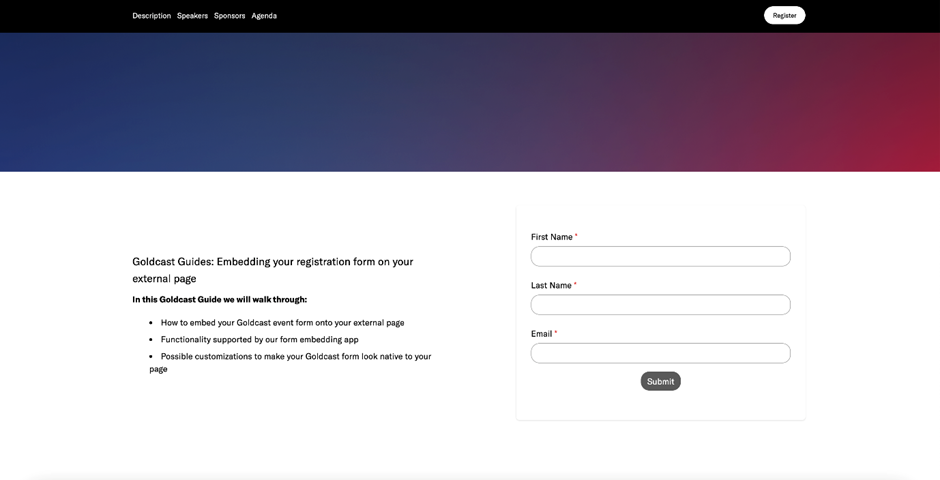
If you want to use embed mode, place a div container element on your page where you want your form to be embedded. Give the div element a unique ID that identifies it. Keep track of this ID because you'll pass it into the containerSelector parameter as a CSS selector in Step 3. In Step 3, you must also set the mode parameter to "embed."
A very simple example of an HTML body set up for embed mode is the following:
<body>
<h1> Sample Registration page </h1>
<p>Register for our test event below</p>
<div id="goldcast-registration-form"></div>
</body>
In this example, we want to embed the form in the div element with the ID goldcast-registration-form. The CSS Selector for this ID is #goldcast-registration-form and is the value we'd pass into the containerSelector parameter in Step 3.
Popup mode
In pop-up mode, you'll create register CTAs on your page that will open your form in a pop-up when clicked. Below is an example of a page using the pop-up mode.
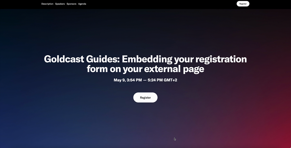
To make your form pop-up, you'll need to create buttons on the page where you want to open your form. You'll pass the CSS selectors of these buttons as an array into the buttonSelector parameter described in Step 3, and we'll automatically add click handlers onto them so the form shows when the buttons are clicked.
Below is an example of an HTML body set up for pop-up mode. In this example, there are two register buttons we want to open the form popup when clicked.
<body>
<h1> Sample Registration page </h1>
<p>Click the Button below to register</p>
<button id="register-button-1">Register</button>
<p> This event will teach you all about how to embed
  your goldcast registration form on your external page
</p>
<button id="register-button-2">Register</button>
<body>
The selectors for these buttons would be #register-button-1 and #register-button-2. You'd pass these selectors as an array into the buttonSelector parameter in the form loading function in Step 3. This way, our code can find your buttons and attach the code that opens the form popup when it is clicked.
Step 3: Loading your form
This section dives into the snippet that's responsible for initializing your form with the configurations you want and rendering it onto your page. The snippet needs to be run after the script tab from Step 1 is finished loading. For most cases, placing it in a script tag in your document's body should work fine. If you run into issues, you can create a function to handle the onload event of the script tag in Step 1 and run the snippet in that function. This ensures that the snippet runs right after the script from Step 1 is loaded.
Event Form Embed Example
Below is an example of the snippet that needs to be run and the set of required parameters that need to be passed in for your event form to load.
let widget = new window.GOLDCAST.RegistrationWidget({
event_id: '<your event id>' ,
mode: 'embed', // Accepts 'embed' or 'popup'
containerSelector: '#goldcast-registration-form', //Only needed in embed mode
buttonSelector: [ // Only needed in popup mode
  '#register-button-1',
  '#register-button-2'
],
theme_obj: {},
backendUrl: 'https://backend.goldcast.io'
});
Note: Smart Forms are compatible with external registration pages. To use a Smart Form on an external page:
- Add the Smart Form to the event in Goldcast first.
- Add the parameter
isOneClickEnabled: truein the embed script. - Pass that same event's
event_idinto the embed script. - If you reuse the same external page template for multiple events, update the
event_ideach time, or automate that value through your CMS.
Smart Forms rely on browser local storage and cookies to recognize returning visitors, so browser settings can affect returning-visitor behavior on external pages.
Series Form Embed Example
Your event series form can also be embedded on your external page. Below is an example of a configuration that loads a series registration form.
let widget = new window.GOLDCAST.RegistrationWidget({
  seriesId: '60eec8c1-c05b-4282-99b3-37a52285270b',
  isSeries: true,
  registrationFormUrl: 'https://form.alpha.goldcast.io/alpha-qfpfnbyakgallva/de4d23c0-b589-40b7-a2f3-bc5e57e71b97',
  // Reach out to Goldcast support to get your registration form URL
  mode: 'embed', // Accepts 'embed' or 'popup'
  containerSelector: '#goldcast-registration-form', //Only needed in embed mode
  buttonSelector: [ // Only needed in popup mode
    '#register-button-1',
    '#register-button-2'
  ],
  theme_obj: {},
  backendUrl: 'https://backend.goldcast.io'
});
Note: You can also embed a repeating event registration form on an external webpage. The process is the same as that of a series. However, you must replace the SeriesID in the snippet shared above with the Blueprint EventID.
Configuration Parameters
The table below lists the parameters to configure your form.
| Parameter | Description |
|---|---|
| event_id |
Required for event form Accepts: Goldcast Event ID as string Description: The event ID that you want to register users for when they fill out your form. For Smart Forms on external registration pages, the Smart Form must already be attached to that same event. |
| seriesId |
Required for series form Accepts: Goldcast Series ID as string Description: The series ID that you want to register users for when they fill out your form. |
| isSeries |
Required for series form Accepts: true or false as boolean Description: Parameter to tell our embedder that form being loaded is for a series |
| registrationFormUrl |
Required for series form Accepts: Registration Form URL as string Description: A unique URL that is used to load your registration form. This is not your browser's URL when you are editing your form, it's a URL managed in Goldcast's Backend. Reach out to Goldcast support to retrieve this value. |
| mode |
Required Accepts: 'popup' or 'embed' Description: Decides the display mode discussed in Step 2. |
| containerSelector |
Required if mode is 'embed' Accepts: CSS Selector of div HTML element Description: This parameter takes the CSS selector of the div container you want to embed your form into. The container must be present in the DOM when it's passed into this function. |
| buttonSelector |
Required if mode is 'popup' Accepts: Array of CSS Selectors for CTAs Description: This parameter takes an array of CSS selectors for register CTAs on your page that will trigger the form to popup when clicked. The CTAs must be present in the DOM when they are passed into this function. |
| theme_obj |
Required (can be an empty object) Accepts: Object Description: The theme_obj parameter is an object that accepts its own set of parameters that control the styling of the registration form. Read the Step 4: Theme Object section to see what parameters can be passed into the theme_obj. |
| backend_url |
Required (For Internal Use Only) Accepts: 'https://backend.goldcast.io' |
| registrationSuccessMessage |
Optional Accepts: String Default: You are now registered. You will receive an email confirming details shortly.
Description: This parameter allows you to choose the verbiage that displays after a user successfully registers. Example: Registration successful! You should receive an event confirmation email with your unique login link shortly. |
| iframeHeight |
Optional Accepts: CSS height value as string default: 700px Description: This parameter allows you to fix the height of the iframe. Examples: 700px, 100%, 50vh |
| iframeWidth |
Optional Accepts: CSS width value as string Default: 550px Description: This parameter allows you to fix the width of the iframe. Examples: 500px, 25%, 25vw |
| autoResizeIframeHeight |
Optional Accepts: true or false as boolean Default: false Description: If this is set to true the iframe's height will automatically adjust to the height of the form. Having a text area form field or having conditionally displayed fields are two cases where your form height can vary and you might want your form window height to change with it. |
| onLoad |
Optional Accepts: Callback Function Description: The onLoad parameter takes a callback function that will be triggered when your form first loads on your page. No arguments are passed into the callback function. |
| onRegistered |
Optional Accepts: Callback Function Description: The onRegistered parameter takes a callback function that will be triggered after a user successfully registers on the form. The user's submission data will be passed into the callback function as an argument. |
| onFailure |
Optional Accepts: Callback Function Description: The onRegistered parameter takes a callback function that will be triggered after a user successfully registers on the form. An error message will be passed into the callback function as an argument. |
Note: There is no Form ID parameter, only Event ID. We load the registration form that is set on the event that you choose. This means if you change the form on your event, your external page will automatically reflect your form changes. Learn how to set your event's registration form here.
Step 4: Theme Object
In this section, we'll go over the different flags that can be included in the theme_obj parameter to style your form.
| Parameter | Description |
|---|---|
| popupCornerRadius |
Accepts: CSS size value as string. Only applicable if the form is in popup mode Description: This parameter allows you to specify the border radius of the popup window when your form is in popup mode Examples: 0px, 5px, 1rem |
| showCardShadow |
Accepts: true or false boolean. Only applicable if the form is in popup mode. Description: A shadow helps a popup element look more 3-dimensional. Set this parameter to 'true' if you want a card shadow applied to your form popup. |
| splash_font_type |
Accepts: 'Custom Splash', 'Web Font', 'Web Safe Font', or 'GT-America' Description: This parameter lets you select which type of font you want to use. Check out the section Choosing a Font to learn more about customizing your form's font. |
| splash_theme_font_src |
Accepts: A link to your uploaded custom font. Only applicable when splash_font_type is Custom Splash Description: If you want to connect your own custom font files to your form, you'll need to upload them to a storage server and then pass the public link into this parameter. |
| splash_theme_font_link |
Accepts: A link to a web font. Only applicable when splash_font_type is Web Font Description: If you want to use an existing web font you can pass its URL into this parameter Example: If we want to use Google's Tangerine font documented here, we would use the following link for this parameter. https://fonts.googleapis.com/css?family=Tangerine
|
| splash_custom_font_name |
Accepts: The name of the web font linked to by the splash_theme_font_link parameter. Description: This parameter takes the name of the web font you want to use Example: Continuing off the above row's example, we would load Tangerine into this parameter |
| splash_theme_font_name |
Accepts: The name of a web-safe font. Only applicable when splash_type_font is Web Safe Font Description: Use this parameter to specify the web-safe font you want to load on your form Examples: Arial, Times New Roman, Verdana |
| "--splash-background-color" |
Accepts: CSS Color value as string Description: this parameter controls the background color of the form. Examples: #f7f7fa, rgb(240, 200, 220) |
| "--theme-secondary-color" |
Accepts: CSS Color value as string Description: This parameter controls the color of the buttons and loading circles on the form. Examples: #0049db |
| "--splash-background-shade" |
Accepts: Comma separated RGBA value as string Description: This parameter controls the background color of the form field inputs.
Examples: 255, 255, 255, 1 |
| "--splash-text-color" |
Accepts: CSS Color value as string Description: This parameter controls the text color of the form question labels, the typed responses, and the registration success message. Example: black |
| "--secondary-text-color" |
Accepts: CSS color value as string Description: This parameter controls the text color inside the form's buttons. Example: white |
| "--error-color" |
Accepts: CSS color value as string Description: This parameter controls the text color of the error messages that show when invalid form responses are entered. Example: red |
| "--input-border" |
Accepts: CSS border value as string Description: This parameter controls the style, thickness, and color of the input field's borders on the form. Example: 'solid 1px #ced4da' |
| "--input-radius" |
Accepts: CSS size value as string Description: This parameter controls the radius of the form's input fields. Examples: 10px, 1rem |
| "--button-radius" |
Accepts: CSS size value as string Description: This parameter can be used to control the radius of the buttons on the form Examples: 10px, 1rem |
| "--label-fontsize" |
Accepts: CSS size value as string Description: This parameter can be used to control the font size of your form fields' labels. Examples: 10px, 1rem |
| "--vertical-spacing" |
Accepts: CSS size value as string Description: This parameter can be used to control the spacing between your form fields. Examples: 10px |
| "--form-padding" |
Accepts: CSS element padding value as string Description: This parameter can be used to control the padding around your form. Examples: '10px', '10px 15px', '10px 15px 20px' |
Choosing a font
By default, our forms use the GT-America font family, but we have parameters available to allow you to use different fonts. You have three options for picking a different font: use a web-safe font, link to another web font, or link to a custom font.
Using Web-safe fonts
To use a web-safe font, set the splash_font_type parameter to Web Safe Font and set the splash_theme_font_name to the name of the web-safe font you want to use.
Linking web fonts
There are thousands of web fonts online that can be accessed via URL. You can load one onto your form by setting the splash_font_type parameter to web font, the splash_theme_font_link parameter to the web font's URL, and the splash_custom_font_name parameter to the web font's name.
Using your own web font
You can use your custom font on the form by uploading it to a storage service such as S3, setting splash_font_type to Custom Splash, and then setting the splash_theme_font_src parameter to the public URL where the font files are stored so that our embedder can download and load them into the form.
FAQs
1. Can my embedded Goldcast form collect UTM Parameters?
Yes, even when your form is embedded on an external webpage, it can still collect UTM parameters. You need to make sure that your form is set up with the right fields so it can read and process the UTMs in your registration page URL. You can learn more about setting up your form to process UTMs in this UTM tracking guide.
2. Is the form embedded inside an iFrame?
Yes, we load the form onto your page from inside an iframe. This is currently the only option Goldcast supports.
3. Can we add custom CSS or JS to the form to have more control over its look & feel?
No, for the moment, we don't support custom CSS or JS because the form is in an iframe. Code created outside the scope of the iframe won't impact the contents within it.
4. Do Smart Forms work on external registration pages?
Yes. Goldcast confirmed with engineering that Smart Forms are compatible with external registration pages.
To make this work correctly, the Smart Form must be connected to the same event referenced by the event_id in your embed script.
If your team uses one external registration page template across multiple events, the script's event_id should be updated for each event, or dynamically populated through your CMS.
Smart Forms rely on browser local storage and cookies to recognize returning visitors, so expected behavior may vary depending on the visitor's browser settings.